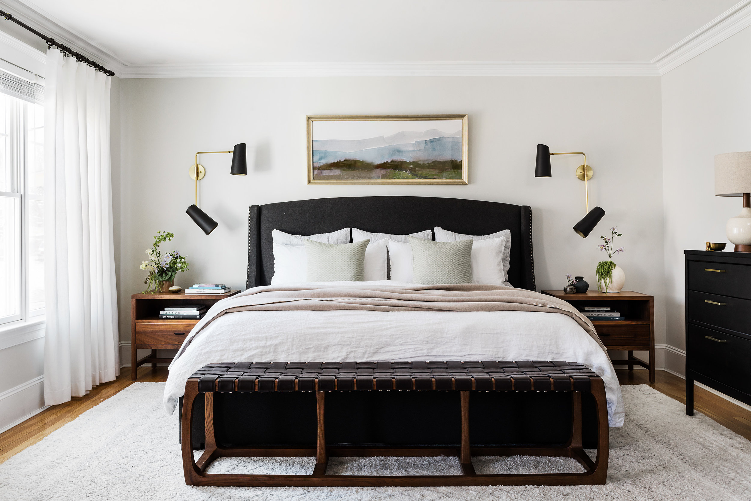
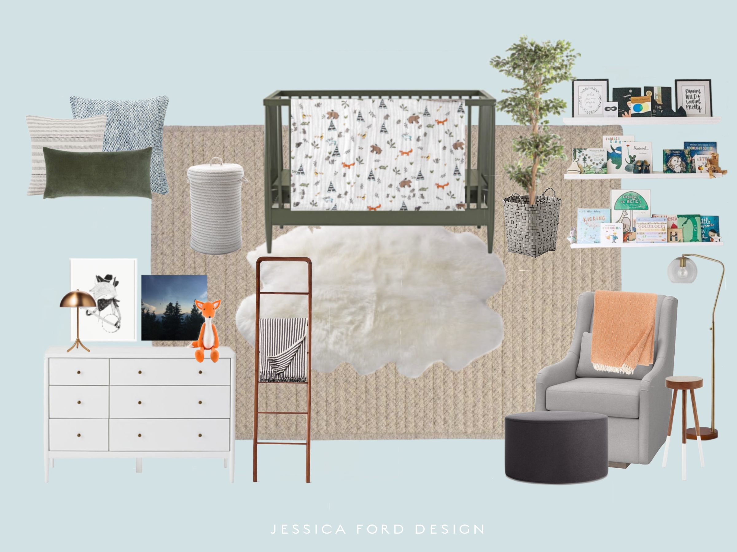
I’m excited to introduce you to our finished Belmont master bedroom project. I never got around to sharing the before photos and design plan with you when we started the project, so I’ll give you the full scoop today. Our client moved into this home with a couple of existing pieces they were hoping to re-use - their bed and dresser. Although this furniture was very strong and heavy, the goal for the room was to create a space that evoked a soft, serene feeling, a little “oasis” if you will.
Here’s what we started with before they moved in…
Not a bad start, but the room had some layout challenges which led to the french doors being removed and the closets being relocated beyond that point. This allowed us to free up some space for the dresser. The window was also removed above the bed. While I’m a big fan of windows and natural light, it just felt odd and in the way.
We started out by coming up with a design scheme that balanced their existing furniture pieces while adding warmth, texture and interest. The walnut nightstands and bed bench paired with leather offered an organic and natural feel while still feeling heavy enough that the bed and dresser did not feel out of place. We chose a super neutral and plush rug, sheer curtains and textured linen bedding to add softness to the space. And to accent the room, we added a statement to the dresser with some funky mid-century lamps paired with linen shades, and my favorite sconces with bold black shades and warm brass accents to anchor the bed and nightstands. The large mirror above the dresser adds another hint of brass and reflects the light from the windows to give the room a more balanced feel. Lastly, the subtle soothing artwork above the bed adds to the feeling of softness and serenity.
The end result came out beautifully, a calm but lively bedroom retreat with carefully thought out details and a fun mid-century twist.
Interior Design and Styling by Jessica Ford Design
Floral Styling by Wild Folk
Photography by Joyelle West
Renovation by Na Fianna Construction


